Apollo Black: A Practical Display Font for Modern Web Design
I was staring at a blank hero section on a client’s landing page, trying to find that perfect balance between bold impact and digital readability. The brief called for something authoritative yet approachable—a typeface that could anchor a high-end coaching brand without feeling stiff or corporate. I scrolled through my usual library of sans-serifs, but they all felt too generic. Then I pulled up Apollo Black. It wasn’t just another heavy weight; it had a distinct personality that immediately shifted the entire mood of the layout.
This is a real-world look at how Apollo Black fits into modern web design workflows. If you are a UI designer, digital product creator, or online business owner looking to elevate your brand identity, understanding how display fonts function in a digital environment is crucial. This isn’t about abstract art theory; it’s about making pixels work harder for your user experience.
First Impressions: Visual Weight and Digital Presence
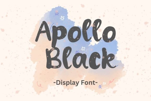
Apollo Black is classified as a display font, which means its primary strength lies in short bursts of text rather than long-form reading. Visually, it carries a substantial presence. The strokes are confident, with clean terminals that feel modern and uncluttered. When I dropped it into a Figma mockup for a boutique e-commerce site, it didn’t just sit there; it commanded attention.
In web design, "weight" can be tricky. Too light, and the text gets lost against complex backgrounds. Too heavy, and it creates visual noise that fatigues the eye. Apollo Black strikes a rare equilibrium. It feels premium without being pretentious. For a creative portfolio or a course sales page, this kind of typography signals professionalism instantly. It tells the visitor that the content behind the headline is worth their time. The font’s geometry is precise enough to look engineered, yet it retains a subtle warmth that keeps it from feeling cold or robotic.
Strategic Placement: Where Apollo Black Shines
Not every font belongs everywhere. One of the most common mistakes designers make is using a decorative display font for body copy. Apollo Black is not designed for paragraphs. Its character width and spacing are optimized for headlines, subheads, and impactful statements. Here is how I recommend integrating it into your digital projects:
- Hero Sections: Use Apollo Black for your main H1 tag. Because it is a black weight, it requires less visual space to achieve maximum impact compared to lighter weights. This allows for cleaner layouts where the image and the text share the stage equally.
- Call-to-Action (CTA) Areas: While standard buttons often use sans-serif fonts for clarity, using Apollo Black for the button text itself can create a unique branded element. Just ensure the contrast ratio meets accessibility standards.
- Section Headers: Break up long scrolling pages by using Apollo Black for section titles. It acts as a visual anchor, helping users scan the page structure quickly.
- Digital Ads and Social Graphics: Since this is a commercial font suitable for various uses, it performs exceptionally well in static ads where space is limited. The boldness ensures legibility even at small thumbnail sizes.
For example, on a recent project for a digital wellness coach, we used Apollo Black exclusively for the value propositions on the homepage. Instead of bullet points, we used short, punchy phrases set in this font. The result was a page that felt curated and intentional, rather than a wall of text.
Readability and Responsive Behavior
Testing typography on mobile devices is non-negotiable. A font that looks majestic on a 27-inch monitor can become illegible on a 6-inch screen if the sizing and line height aren't managed correctly. Apollo Black has generous counters (the open spaces inside letters like 'o' or 'e'), which aids readability even when scaled down.
However, because it is a display font, you must be careful with responsive breakpoints. On mobile, consider reducing the font size slightly more aggressively than you would with a standard body font. Also, pay attention to letter-spacing. Tight tracking on a bold display font can cause characters to merge visually on low-resolution screens. I usually add a slight increase in letter-spacing for Apollo Black on mobile views to maintain its airy, modern aesthetic.
Another critical factor is background contrast. Apollo Black performs best against light or neutral backgrounds. If you are placing it over an image banner, a semi-transparent overlay is essential. The darkness of the font needs a clean canvas to pop. Using it on dark backgrounds with white text can sometimes lose some of its crisp edge due to anti-aliasing issues on certain browsers, so always test in Chrome, Safari, and Firefox before finalizing.
Font Pairing for Cohesive Brand Identity
The secret to a polished web design is contrast. You cannot build an entire website hierarchy on one font family, no matter how versatile. Apollo Black serves as the "voice of authority," so it needs a partner that handles the "voice of explanation."
My go-to pairing strategy involves matching Apollo Black with a simple, highly readable sans-serif font for body copy. Think of fonts like Inter, Roboto, or Open Sans. The neutrality of the body font allows the bold personality of Apollo Black to take center stage without competing. The clean lines of the sans-serif complement the geometric nature of the display font, creating a harmonious visual rhythm.
For brands leaning towards a more editorial or sophisticated vibe, you might consider pairing Apollo Black with a classic serif font for secondary headings. This combination bridges the gap between modern minimalism and traditional elegance, which works wonderfully for luxury goods stores or high-ticket service providers.
Technical Considerations for Web Implementation
Before dropping Apollo Black into your CSS, check the file formats. Ensure you have access to WOFF2 files for optimal loading speeds. Display fonts can sometimes have larger file sizes, so compress them properly to avoid hurting your Core Web Vitals. Additionally, verify the licensing terms. While Apollo Black is suitable for commercial use, always confirm if it covers unlimited web domains or if you need specific webfont licenses for client projects.
Also, look at the available weights. Does the family offer italics? Medium weights? Having a range of options allows for better typographic hierarchy. Even if you primarily use the Black weight for headlines, having a lighter alternate for pull quotes or captions adds depth to your design system.
Elevating Your Digital Products
Typography is often the unsung hero of conversion. Users form an opinion about a website’s credibility within milliseconds, and the font choice plays a massive role in that first impression. Apollo Black offers a shortcut to a polished, professional look. It removes the guesswork from headline design, allowing you to focus on messaging and user flow.
Whether you are redesigning a blog, launching a new SaaS landing page, or updating your online store’s brand kit, taking the time to select the right display font pays off. Apollo Black provides that extra layer of refinement that separates amateur designs from expertly crafted digital experiences. It is sturdy, stylish, and ready to handle the demands of modern web layouts.
Start by testing it in your next hero section. Watch how the visual weight shifts the user’s eye. Notice how the confidence of the typeface translates into confidence for your brand. In the world of digital design, those small details are what build trust and drive engagement.